HCI Project 2007

HCI 2 is a module at the Computer Science school at the University of Birmingham. The HCI Project 2007 blog is the place where the team will discuss ideas and processes involved in developing a 'useful piece of technology' for our target audience - children <= 11 years old.

Friday, March 30, 2007

Learning Outcomes Identification

Explain and discuss practical and theoretical aspects of Human-Computer Interaction.

Post about Fitt's law and how we should follow it.
Post about Hick's law and how it applies to our menu system.
Post regarding how sound should be 'displayed' as well as heard and how our system matches that practical theory.
Photographs of mindmaps showing the results of discussing the ergonomic design of the initial prototype

Our meeting posts all include parts that detail our discussions about aspects of the human-computer interaction topic.
Case studies, most discuss the practical and theoretical aspects of human computer interaction by evaluating new technologies or technologies aimed at children.

Apply HCI principles to practical problems.

Developing Personas for evaluating our design ideas
Using a questionnaires to gather information to tackle practical problems
Prototyping and solving issues with them.
Using a a range of Evaluation techniques on the prototypes

Participate in analysis and design work in HCI.

Identifying the target audience
Identifying key information about the target audience
Identifying potential ideas
Designing the final project ideas and eliminating the poor ones
Use cases
Use scenarios
Questionnaires and analysis of results
Prototyping of device
Critical appraisal

Case studies analysing new technologies and technologies aimed at children

As we have over 130 posts, it is very difficult to point you in the direction of single posts, hence why a lot of the links above are to labels covering groups of posts that cover the section. However, if we were to extensively list every post that matches the sections above, we would probably have over 60 links. Please take this into account.

Thursday, March 29, 2007

Conclusion: The Project Finale

The main objective of the project was to design a useful piece of technology for children under the age of 11. Our team focused on children between the ages of 7 and 11, as outlined in this post.
We have followed the User-Centred Design approach, as outlined by Russell during the lectures, to tackle this objective. Part of the process involved us creating personas based on our target audience. This ensured that the potential user space was consulted at every stage of development and therefore that the device would appeal to children.

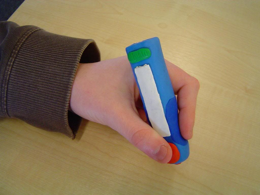
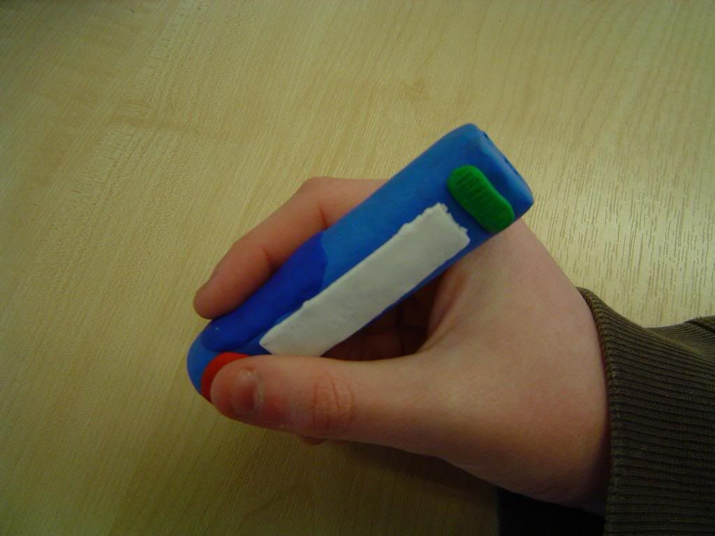
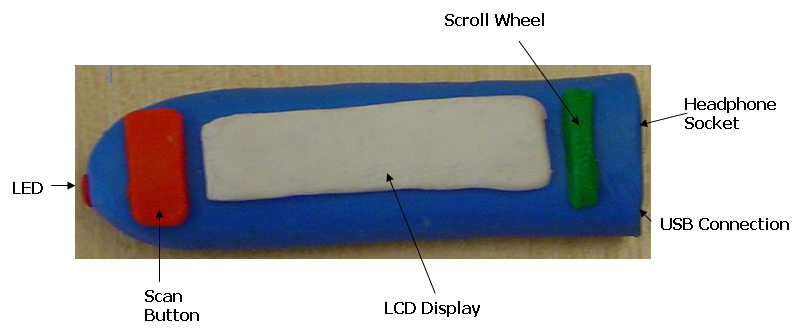
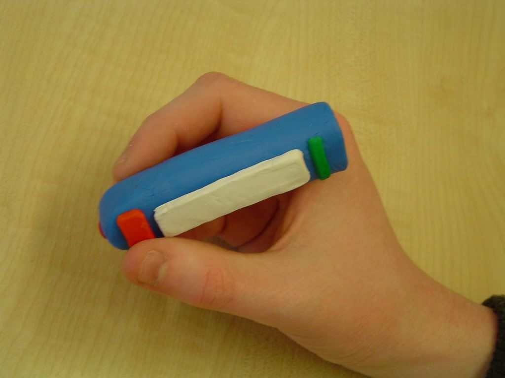
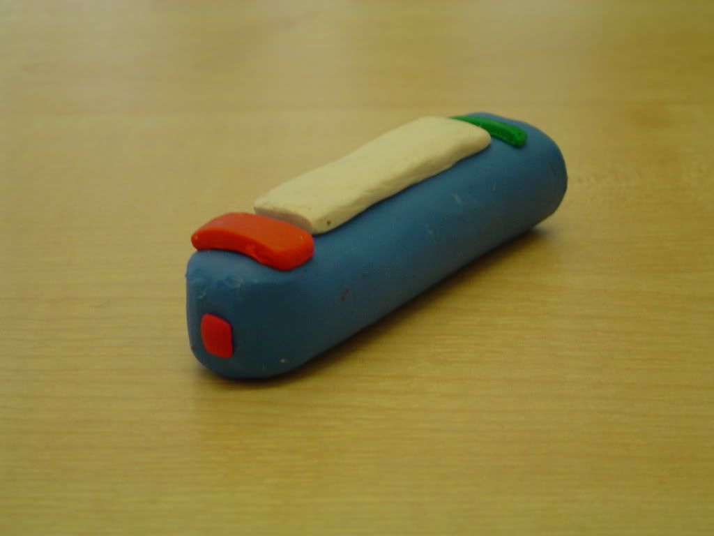
We used a large variety of evaluation techniques. The Cooperative design with Paul Anderson (one of the personas) allowed us to gain vital feedback from the user base about the prototype designs. Paul is left handed, and if we hadn't of used this evaluation technique, we would never have realised that the scanner's screen was the wrong way round when a left handed person held it. This, as well as other points made by Paul, allowed us to develop our design to guarantee that children would be able to use it. The Cognitive Walkthrough and the Heuristic Evaluation both supported and contributed to this.

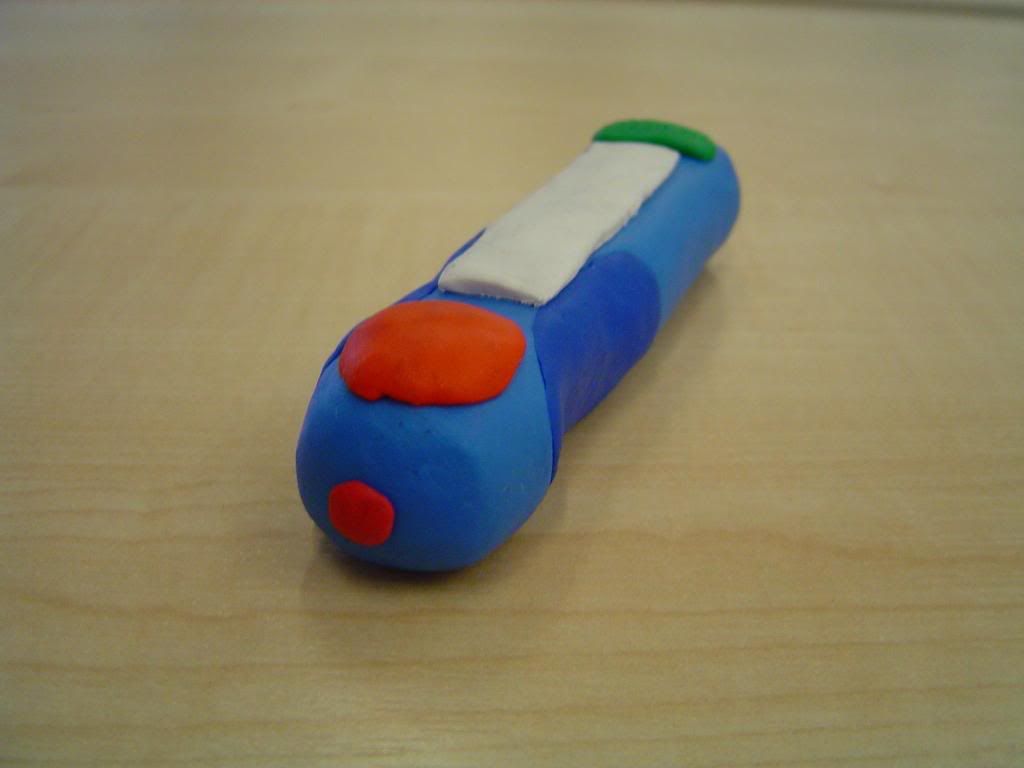
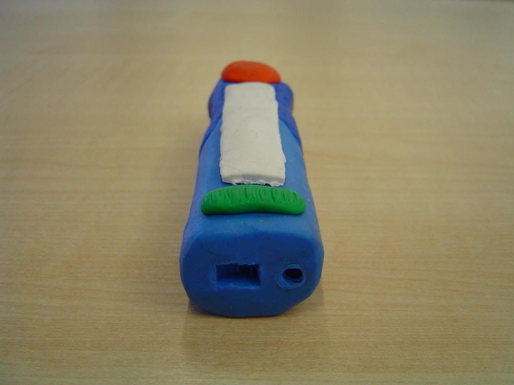
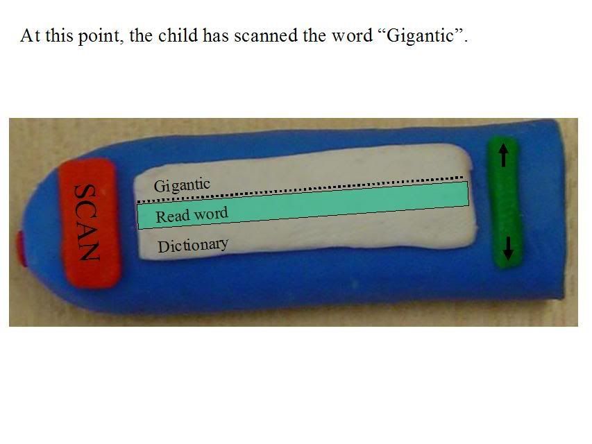
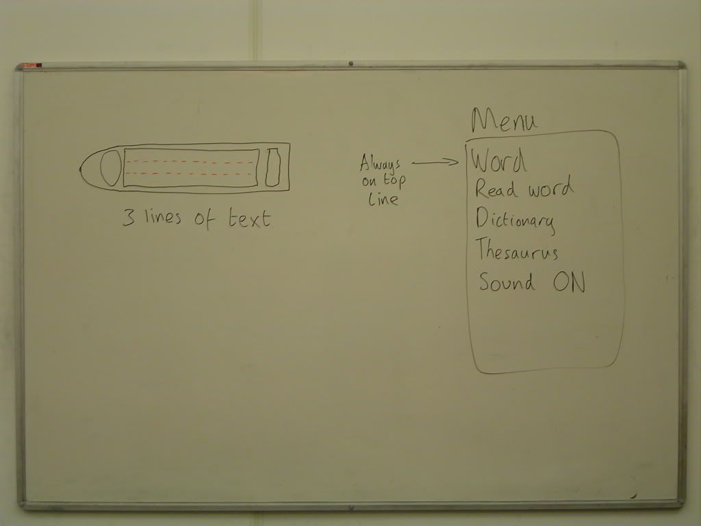
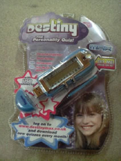
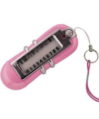
The word scanner will help children to learn to read, which, by definition, makes it an extremely useful piece of technology. It has been designed in such a way that it will be quick and easy to use, thus increasing the likelihood that children will use it.

It is clear from the above points that the team has successfully met this main objective.

However, as our final evaluations stated, there are still some issues with the word scanner. The most damaging is that the Dictionary definition and Thesaurus entries may also be too difficult for a child to read/understand. There are also issues with some words having many meanings. These are all matters that come from the nature of the English language. The team has discussed this issue and they believe that the only way that it can be dealt with is by trial and improvement. Fortunately our scanning device can be updated automatically when it is plugged into a PC with an Internet connection, so it will only improve in the future. Hopefully by tackling words that children are most likely to come across and struggle with, the issue will be addressed.
The team built up an extensive research area, allowing us to dip into it every time we needed some help with designing the device. This was very helpful throughout the project, especially when choosing our initial ideas, as we could identify niche areas within the current market and apply the ideas we gathered from our research to them.

As outlined above, our personas were very useful to us. The reason for this is that the team made them very strong and diverse, covering a large section of the target audience. By avoiding creating personas that were too similar, helped us really understand what the potential users wanted.

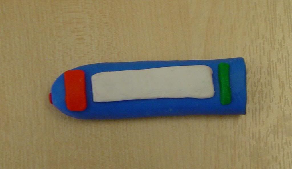
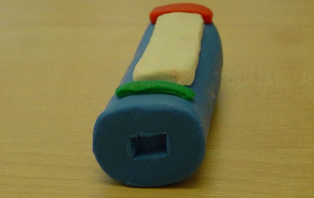
The team successfully designed the word scanner by using a wide range of prototype designs and concepts. This meant that at every stage we were building on solid project foundations. Each new prototype brought with it new inspiration and innovation, leading to the ergonomically designed word scanning device that we have now.

Finally the team worked well together. There was a real sense of camaraderie and excellent teamwork. The team benefited from having two meetings a week, which helped us develop our ideas thoroughly and quickly. The cross communication was excellent also, everybody's ideas were listened to and evaluated with no exception.

The team are very pleased with the final result. However, there are some areas we would tackle differently in the future. It would have been very beneficial to of actually gotten in contact with some children, rather than solely relying on the personas. If we had more time, this would definitely be an avenue we would pursue. Furthermore, we initially had 2 strong ideas, it would have been valuable (if we had more time) to of developed these ideas in parallel, which would have ensured that the weakest one was definitely identified, but at a later stage.

Labels:

Conclusion: John's Personal Conclusion

My overall conclusion of our HCI project is that our progress over the past term was quite remarkable and shows that our team moulded together rather effectively and produced a high standard of work in a relatively short period of time. This was mostly down to regular meetings to review our development and to discuss future progress in the designs of our ideas.

I feel that our final design concepts for the word-scanning device show great depth and understanding for a possible gap in the market where such a device could be utilised. I believe that this was achieved through the use of in depth research into the specific field, following a ‘user centred design’ process and in particular using personas to review our design decisions.

Personas are a good way to develop a concept by reviewing choices made during the design phase, though the eyes of the products target audience. This way we can see where a design’s features are in need of improvement or development. I feel that the personas we came up with for our project provided a good insight into possible users of our design and helped us observe issues with our original prototype, which we would of never thought of on our own accord.

Overall I think our project was a great success and was a good insight into the issues of human computer interaction. Everything was well documented in the team’s blog and a concrete design concept has been achieved.

If we were to redo this project again I feel that it could have been improved though the use of feedback from actual target users as well as personas developed with the concept in mind. Time constraints were also a major issue with the project and trying to achieve everything the team set out to do in this period was a challenge, with more time available our concept could have been developed further with more extensive documentation on the blog covering every aspect.

Labels:

Conclusion: Mark's Personal Conclusion

As a team, I believe we functioned very well, showing evidence of strong communication and dedication to the project.

The final product is a very strong concept and is well designed in terms of both the physical and software features.
By testing the product on a group of personas twice, it meant we could come up with a strong re-prototype in order to iron out all the problems we missed in the first stages of design.

On a personal note, using personas was a good learning curve for me - it's not something i'd ever considered using before, and as such gave me a good insight into how developers of products act when there is no sample audience available.
The user-centred design practise was also very worthwhile as it is far easier to grasp the concepts using a hands-on approach rather than simply reading and researching it.

Overall, I think the team worked very well together - no-one acted as the overall 'leader', although Elliot took on a co-ordinating role in organising meeting times and tasks, which was beneficial for all involved as it would have been quite easy to not take a long task like this seriously.

In summary, I feel the project, product and blog were a huge success.

Labels:

Conclusion: Elliot's Personal Conclusion

My 'management' role within the team developed from convenience rather than necessity. Any person within our team was capable of being the project manager, and as the manager I did not feel that I was the sole person keeping the team on track, the team made my job very easy. I mostly made sure everyone was aware of when and where meetings were and also made it my responsibility to check any team queries with Russell and/or the Supervisors. During meetings I found myself merely summarising the groups decisions/thoughts and at no point felt like I was the captain of a sinking boat. I liked the responsibility and would seek it again in the future.

I enjoyed working in the team. The use of the blog gave us an area to splash ideas down quickly, but in a formal environment. I believe it helped harbor and develop some of our strongest ideas and posting as a team meant that our ideas could spread and grow rapidly.

In terms of HCI, the project has opened up new avenues for development. I had never created a persona before, but I liked the experience. It gave me a chance to really get into the minds of the target audience, and I think, even if you have easy access to a large subset of your target audience, personas can still aid development.

I believe the product that we have designed is a fine one. It's charm is in it's simplicity. Although there are some weaknesses in the tool (see the main conclusion and the evaluations), I think the team has successfully designed a useful piece of technology for children.

If I were to do this project again, I would perhaps try and document our decisions in more detail, it's easy to assume that you have done when the group has discussed them thoroughly in the meetings. I would also of liked to have gotten access to a subset of the target audience, but due to the time constraints, this wasn't feasible.

I would just like to close by again stressing the real class of the team, the best I have ever worked with. We have, even with the other stresses during our final year, enthusiastically tackled the problem and have an excellent blog to demonstrate this. I'm personally astonished by the shear number and frequency of the posts on the blog, further showing the team's impeccable nature.

Labels:

Conclusions : Ash's Personal Conclusion

I feel that the strength in this project has been its breadth of ideas. Unlike many similar projects this one began with a range of concepts which were each explored and discounted for one reason or another until the strongest idea was left. This approach meant that we had an excellent concept with which to begin development with and a good sense of direction.

The user-centered techniques discovered and developed have certainly been beneficial to me. The use of personas seems to be a point which everyone has gained a lot from, but it is smaller things involved with considering the user while designing which have had most impact for me. It has always been a tendency of mine to design things to be similar to those which have gone before, however this project has shown me that involving the user in the design process can lead to far stronger solutions.

This learning process has been greatly aided by the team. While exploring our ideas and concepts in such depth has been stressful at times, in the the end what has resulted is an excellent product which we are all very pleased with. This team has thrived because of the strength of character of every member and a strong commitment to the project.

Labels:

Wednesday, March 28, 2007

Conclusion: Adele's Personal Conclusion

During this project I have learnt a great deal about user centered design by experiencing it in practice instead of only reading about it. I felt the team worked together efficiently and was well organised.

I enjoyed creating our original idea mind maps and how the team helped develop each members ideas. I wasn't too keen on discounting our Healthy Eating Device idea because I felt it had some good features and a lot of potential, however in the end I agreed that it would not be a device children would be inspired to use, therefore not worth developing for our target audience. I found that creating our own personas proved very useful especially when we all acted in character to answer questionnaires.

I think we could of benefited from having the chance to ask children what they would of thought of such a device and to ask them to suggest features they would like, unfortunately we never had the opportunity. Overall I am pleased with the progress we made and our results, I feel the project was definitely a success.

Labels:

Monday, March 26, 2007

Admin: Meeting 13 and Beyond

Our meeting structure has become untenable due to the deadlines we've all got scattered around our last week.

Fortunately we have always scheduled our meetings for times when we are usually around University anyway, so we should still attempt to meet up at least once more before the deadline on Friday 30th March.

Now that the responses for the questionnaire have all be done (Ash's response is not available if someone could edit the post and shove it on, that would be great), so Mark can now analyse the results.

Evaluations will all be up shortly too (mine will be going up after this post).

This now leaves the last week to do the Conclusions (Russell should mention more on that today). I would also like to spend the time fixing areas of the blog that are weaker than others, so if you see somewhere that could be bolstered, try and get it done ASAP.

Have a good final week of term, don't burn yourselves out and lets finish this blog off in style!

Labels:

Monday, March 19, 2007

Evaluation: Second User-Designer Session

A Cooperative evaluation with Paul using new device (scanning only):

Paul is given the device and a sheet of paper on which is printed an extract from Alice in Wonderland.

Designer: OK Paul, could you please scan the fifth word on the page.

Paul holds the scan button down and scans the word. He uses both hands to operate it as before. Paul clearly benefits from his previous experience with the device and scans the word correctly first time.

Paul: "It says rabbit"

Designer: "OK Paul, now because you are left handed we need to change the screen so it's the right way up for you. See if you can find the setting on your own."

Paul scrolls through the menu and find the setting, then changes it.

Paul: "That's better, I can hold it the right way now."

Paul reads out the word and its definition.

Designer: "Do you like this new device, is it more comfortable?"
Paul: "Yes, it's much easier to hold, it doesn't slide about as much as before."
Designer:"OK just like last time, I want you to just scan some words."

Paul scans various other words without problem, the novelty begins to wear off and Paul doesn't seem to be enjoying the device like he did before. He turns the sound on and laughs so more at the voice. Paul scans a word and looks confused.

Designer: "What's the matter Paul?"
Paul: "I don't understand this definition."

Paul reads out the definition and the designer explains the word.

Results

For Paul the novelty of the device is beginning to wear off, this isn't to say that the device isn't useful.

Screen inversion in the left-handed position is now solved and Paul was happy with the new settings.

The new comfort grips make the device easier to hold, an improvement on the previous model. The problem of complicated definitions is one which cannot easily be tackled. This shows that while the device is an excellent learning aid it is not a substitute for a parent, guardian or teacher.

Labels:

Sunday, March 18, 2007

Evaluation: Second Cognitive Walkthrough

Here I will perform another Cognitive Walkthrough of the word scanning device based on our new prototype that has been developed. The cognitive walkthrough will be of the same structure as the previous evaluation, which was based on our use cases for the device.

When evaluating each use case I will only talk about the changes that have been made to the device and how they effect each use case. The rest of the evaluation will be the same as the previous cognitive walkthough that was done on the first prototype.


The task:
To scan a word.

Actions required:

  1. Find a word to scan with the device.
  2. Place the head of the device on the first space on the left.
  3. Press and hold the scan button and a beep will be made(if sound is on)
  4. Move the pen slowly to the right across the word.
  5. When the head of the pen has reached the first space after the word, release the scan button, a beep sound will be made again to indicate the scan has finished.


Evaluation:

The conclusions made from this walkthough are the same as before except that once a scan has been performed there is an indication on the LCD screen whether the scan was successful by showing the user the word scanned, or was unsuccessful producing an error message. It is now more clearer to the user when a scan has started and finished due to the built in 'beep' sound that is produced when the scan is about to commence and when it has ended after being passed over a word. However this sound is only produced if the volume is turned up and is not set to 0.

Scanning a word is now also easier to perform by the user as the controls are now accessible by both left handed and right handed people. This was an issue on the first prototype as the controls were awkward to get at if the user was of a left handed nature. This functionality should come naturally to the user as the option to flip the screen round for the correct orientation is one of the main options on the main menu system and is accessed in the same way as the sound, dictionary or thesaurus. The option to flip the screen is clearly indicated with the words "Flip Screen" on the menu, so there shouldn't be any confusion as to what this is, or what it does.


The task:
To access the dictionary definition after a successful scan.

Actions required:

  1. Hold the device horizontally.
  2. Use the scroll button beside the screen and move the scroll button down. This in turn will move the highlighted menu entry down.
  3. Scroll down to ‘Dictionary definition’ on the menu.
  4. Select the ‘Dictionary definition’ by pressing the scroll button in.


Evaluation:

This walkthough is mostly the same as the one made on the previous prototype. The main differences are that the wording in the main menu has been improved to make it completely clear that the resulting action will give the user a dictionary definition rather than a 'Dictionary'. This should make it more obvious to the user that when the 'Dictionary definition' is selected from the main menu, they should expect a definition of the scanned in word as this is still always printed on the top row of the screen, which gives an indication that the definition will be of this word.


The task:
To access the thesaurus entries for the word after a successful scan.

Actions required:

  1. Hold the device horizontally.
  2. Use the scroll button beside the screen and move the scroll button down. This in turn will move the highlighted menu entry down.
  3. Scroll down to ‘Thesaurus entries’ on the menu.
  4. Select the ‘Thesaurus entries’ by pressing the scroll button in.


Evaluation:

This use case is also has a similar evaluation to the previous prototype. The only difference is that of a similar nature to the dictionary use case, the wording used in the main menu of the word scanner has now been improved to clear up some confusion to the user that was presented when the word 'Thesaurus' was an option on the main menu. Now the menu has 'Thesaurus entries' in its place which should make it more obvious to the user that selecting this option will present further alternative words based on the scanned in word. As this is always shown at the top of the screen as before.

Labels:

Saturday, March 17, 2007

Evaluation: Second Heuristic Evaluation

Adapted Generic principles for heuristic evaluation:


  1. Feedback: The child should be aware of what is happening.
  2. Everyday child language: Use language that a child would be comfortable with.
  3. Consistency: Responses should be the same when similar options are selected by the child and it should share conventions currently in use.
  4. Recognition not recall: The child should be able to recognise what they should/can do at a particular step.
  5. Simple design: Keep things crisp and simple and aesthetically pleasing.
  6. Error recovery: Prevent errors from occurring, but if they do, provide a suitable response and an appropriate solution.
  7. Documentation: Any documentation should be simple and concise, as a child will not read it.

General scope of the system:


The system displays a 'scanning' message when the Scan button is pressed. This feedback makes it obvious what is happening. The scanner now beeps when a word has been scanned correctly, thus telling the user that they can now use the menu system on the word.

The language the system uses is simple and easy to understand for children between 7 and 11, which is especially important for the Dictionary definitions and the Thesaurus entries.

Everytime a word is scanned, the options in the menu remain the same. This ensures that the system is consistant. The system also shares conventions found in devices such as pocket translators/personal organisers and mobile phones, where you scroll through the menus.

The design of the menus ensure that the next step is easy to recognise. It has been made easier in the redesign as the menus have more precise headings e.g. instead of Dictionary it now says Dictionary definition, so the child doesn't expect a full dictionary when they click on it. Furthermore the addition of the beep sounds when the user scans a word, helps to enforce the recognition of what to do next.

The word scanner provides only two input controls, namely the scan button and the clickable scroll wheel. This makes interaction simple. The design of the menus is also crisp and simple, avoiding any unecessary clutter. Futhermore, the new design is more comfortable to use with the addition of grips to the sides of the device, this will make using it easier.

The system displays an error message when a word failed to scan and also tells the user what to do next, so that they can recover from what they did.

The documentation is short and concise and should only really be required when the user first attempts to scan a word.


Specific interface elements:


The new size of the device may effect its 'pocket sized' status. It can still fit inside an adult's pocket, but a child's pocket is smaller. However, the increase in size is minimal, so it is unlikely to effect it.

There is still a concern that the definitions and entries offered by the Dictionary and Thesaurus may be too difficult for the child to understand. This would be an ongoing problem with this device, no matter how many prototypes were developed. It would simply need to improve with every version of the product ever released AND it can be developed by the updates the device will receive when plugged into a PC with Internet Access.

Labels:

Friday, March 16, 2007

Prototype: Word Scanning Device Redesigned

Here are the pictures of the new prototype plasticine model made by Elliot. This prototype model indicates all the physical changes made to the original prototype developed.


This picture shows the USB socket on the device along with the headphone socket, which was part of the original concept but was never indicated on the original plasticine model:


Device now works well for both Left and Right handed people, after Paul's walkthrough indicated that because he was left handed the screen was upside down whilst scanning. We have rectified this by adding a screen flip option in the menu system.


Labels:

Case: But can they hear it?

According to the Windows User Interface Technical Articles, any sounds that play that can be turned off (or if the device is used in a noisy environment which leads to the sounds not being heard) should be accompanied by a message.

Our system meets this criteria as now that we have added the 'beeping' sound for when the device is scanning a word, the screen also displays the message 'Scanning'. This is all information regarding the practical aspects of human-computer interaction.

The post from the Microsoft Website can be found here.

Labels:

Thursday, March 15, 2007

Admin: Meeting 13

The thirteenth meeting is scheduled for Monday 18th March from 4-5pm before HCI.

In this meeting we shall discuss the conclusions for our word scanning device some more, as it wasn't really discussed in the last meeting due to 2 team mates not being available.

It will probably be more convenient to talk about the conclusions in this meeting as the evaluations should be done before hand as well as the new model of the word scanning device.

Labels:

Evaluation - Re-Questionnaire Analysis

From the second round of questionnaires, it became quite obvious that the changes we made to the design of the product were a roaring success with the children testing them.

The changes to the ergonomic design were one of the main things picked up on by the test subjects, with added comfort in terms of grip, and ease of holding being cited as major points.

By allowing the children to reverse the text on the screen, it has enabled us to create a single device for both dexterities, which would allow production costs to be greatly cut for the single item. Other comments on the screen included praising the increased size as it allowed the text to be larger and clearer.

There were no real further suggestions from the test subjects - a request to read Italian words is less of a design issue, and simply would involve changing to a different language dictionary/theasurus file in the device.

The only further idea raised from the questionnaires was the possibility of releasing the products in a range of colours or other designs, but this is down to visual preference rather than design.

On the whole, I believe the re-design was a great success as it fulfilled all the points raised about the original prototype.

Labels: ,

Admin: Meeting 12 Summary

Attendants:

Elliot Hyde
Mark Mitchell
John Saunt

Apologies:
Ashley Harris - had to attend another meeting.
Adele Tyler - had a bad migraine.


In today's meeting we discussed what had to be done next for the word scanning device. We talked about evaluation types more which will be posted up for the new redesign of the word scanner in the near future. Another plasticine model is also planned for the new redesign which will posted up at a later date.

Once the above has been done we can then work on towards writing up our conclusions for the project. As we were missing a few members of the team today we didn't spend much time on this topic, as it will probably be best to wait for us all to be here.

Labels:

Wednesday, March 14, 2007

Questionnaire: Word Scanner Re-Testing Responses

Paul Anderson
Tracy Burke
Freddie Ford
Joe Jackson
Kate Patterson


  1. Did you find the device comfortable to use?
    Yes, I like the new grips because they make it easier to hold.
    The grip made the device a lot easier to hold. The extra length hasn't gotten in the way.
    Yes, the grip made it a lot easier to hold.

    Yes, I like the soft grip, it feels good to hold.
    Yes, it fits into my hands nicely.

  2. If you didn't, why?
    NA
    NA
    NA
    NA
    NA

  3. Would you make the device bigger/smaller or leave it the same size?
    I like it how it is now.
    The size is fine.
    The size is great.
    The size is okay, if it was any bigger it would be hard to hold.
    It is a better size now - I wouldn't change it.

  4. Is the scan button big enough?
    Yeah.
    Yes.
    Yeah.
    Yes!
    Yes.

  5. Is the scroll bar easy to use?
    It's easy after you have played with it.
    Yes, the extra size has not changed how easy it is.
    Yes, its really simple.
    Yes, it's like the one on my computer mouse.
    Yes.

  6. Did you find scanning a word easy to do?
    Yes, now I have been shown how it is very easy.
    I know when its scanning by the sounds and messages it gives and I can hold it more like a pen now.
    Yeah its more simpler than last time as the sound shows when a scan has started and stopped.
    I found it useful that it beeped so I knew I had scanned the word correctly.
    Yeah, it's pretty obvious what you need to do.

  7. If you didn't, what did you find hard?
    NA
    NA
    NA
    NA
    NA

  8. Was the speech helpful in understanding the word you scanned?
    It is good for me because sometimes I don't know how words should sound.
    Yes. The speech was my favourite part about both.
    Yeah, I only tried it on words I did not get, and the speech showed me how to say it.
    Yes because with a lot of words, when I read them I don't recognise what they are but when someone says them out loud I do.
    Yes, it meant that words i didn't know were much easier.

  9. Did you find the screen easy to read and understand?
    Yes, I like the new screen.
    The extra size means I can see more on the screen.
    Yes its OK, I can read every word fine.
    Yes it's better now it's bigger. It would be good if the screen could be even more bigger, but then I think the device would be too big for me to hold.
    Yes, now it's bigger it's a lot easier, and can have more things on it.

  10. If you didn't, what didn't you like?
    NA
    NA
    NA
    NA
    NA

  11. Did you find the Dictionary definition and the Thesaurus entries easy to understand?
    Some of them were quite hard and I needed help from mum and the man (the developer).
    Yes, just like last time.
    Yeah i found them a lot simpler than I have seen elsewhere.
    Some of the definitions for the words were a little complicated to understand but the Thesaurus was good because the similar words helped me understand more.
    Some were still a little bit hard, but most of them were easy.

  12. Did you find them helpful in understanding the word you scanned?
    Yes.
    I liked learning about new words, its easy.
    The thesaurus was the most useful as there was always an alternative word which I understood already.
    The Thesaurus was really helpful, yes.
    Yes.

  13. Did you find it easy to connect the device to the PC?
    It's easy now the wire is in.
    The same as before.
    Yes same as the previous pen you showed me.
    Yes, because it connects just the same as Dad's camera.
    Yes, dad showed me the first time and it was easy after that.

  14. Do you prefer the new design over the old one?
    Yes.
    The new one is my favourite, I want one!
    Yes it does the job well.
    I like the new one better.
    Yes.

  15. If so, why?
    Because I can change the screen so it isn's upside down and I like the new grips too.
    The new one is bigger and nice to hold.
    Mainly because it is a lot more comfortable to hold.
    Because it is bigger, and I can now make it louder so I can hear it better!
    It's better looking and feels nicer to hold. And the screen is easier to read.

  16. What further improvements could be made?
    I would like it to read Italian too!
    I would like more sound.
    Can not think of any at the moment.
    It would be good if it came in different colours, I'd like a green one.
    I'm not sure - I can't think of anything else that it needs.

NB: The questionnaire has been engineered with the concept of having an adult talking through the questionnaire with the child, not for the questionnaire to be distributed amongst lots of children. The answers would also be filled in by the adult, and questions that have multiple possibilities or questions with a 'ranged' answer would all be dealt with by the adult, not the child.

Labels:

Questionnaire: Word Scanner Re-Testing

The group decided that the new word scanner design would be tested on the personas using the same questionnaire as before, with only one slight alteration.

The additional questions at the end of the questionnaire will be summary questions, attempting to find out how much improvement has been made and how much more needs to be made:

  1. Do you prefer the new design over the old one?

  2. If so, why?

  3. What further improvements could be made?

Labels:

Monday, March 12, 2007

Admin: Meeting 12

The twelfth meeting is scheduled for Thursday 15th March from 3-4pm (just before C++).

In this meeting we will continue discussing the evaluations and responses of our personas towards the re-design.

Furthermore, with the end of term fast approaching, we will start looking at areas we need to cover in our individual conclusions, so that we can start writing them now, instead of leaving them till the last week.

This meeting will serve as a good reflection meeting where we can discuss areas that we may not have documented fully enough on the blog etc.

We will need to start considering more closely when we will be having our meetings at this meeting, due to project demonstrations looming.

Labels:

Admin: Meeting 11 Summary

Attendants:

Ashley Harris
Elliot Hyde
Mark Mitchell
John Saunt
Adele Tyler

At this meeting we took a moment to reflect on our re-design and what lies ahead. We decided that we would re-test the device on our personas using the same questionnaire, with some additional questions.

We will then evaluate the device again, just as we did before.

With work mounting in other areas, we will attempt to get the evaluations done by next Monday, and then finish off the rest of the work in the last two weeks.

Labels:

Friday, March 09, 2007

Prototype: New Prototype Diagram

I have drawn a more detailed diagram of our new prototype design, click the image below to enlarge it.


Labels:

Admin: Meeting 11

The eleventh meeting is schedule for Monday 12th March (just before HCI2).

The exact length of the meeting still needs to be decided, but if no one has requested that the meeting be made 2 hours long (with the group agreeing to it) then it will be the standard 1 hour.

In this meeting we need to consider re-evaluating our new design and look at areas of our design that we have not posted about previously.

One thing we have to do is document our design lessons, things we learned during the design of the first prototype, that we can apply to the second. I would also suggest doing a second post of the same nature after the re-design too.

Finally we have to write the conclusion.

We're on the home straight now, and I understand the amount of work we all have, but lets spread the work and go out with a bang!

Labels:

Thursday, March 08, 2007

Prototype: New Prototype Design

Here are the pictures taken in todays meeting where we redesigned our prototype.


The key features that were developed from the original prototype were:

  1. A grip has been added to make the pen easier to hold.
  2. The text on the screen has the ability now to flip over so the pen can be used by both right and left handed people with ease(this feature is available in the menu).
  3. The sound volume can now be increased or decreased from the menu system.
  4. A 'beep' tone has been added so that the device beeps when a scan has been initiated and will beep again when the word has been scanned to indicate that a word has been read.
  5. The wording on the menu system has been altered slightly to make it clearer to the user that the 'Dictionary' and the 'Thesaurus' will only show results based on the scanned in word only.
  6. The length of the device has been increased from 8cm to 10cm so that the screen on the device can be made slightly bigger and also provide improved comfort in the hand.

Labels: ,

Admin: Meeting 10 Summary

Attendants:

Elliot Hyde
John Saunt
Adele Tyler

Apologies:
Ashley Harris - Could not find the meeting location.
Mark Mitchell - Apparently was attending at a WHAM appreciation society.

In today's meeting we discussed our word scanner design more and redesigned our prototype based on our evaluations of the original prototype, persona responses and additional ideas.

Now that a new prototype has been developed it can be reevaluated to see if it more suitable at fitting a users requirements.

The pictures from the meeting will be posted later on the blog.

Labels:

Admin: Meeting Rooms

Just to tackle Ash's issue of finding out where we are for each meeting.

Firstly, we're not capable of booking a meeting room, we have to check the booking system before we go to the room, and even then there could be someone in there. We were heading to room 245 (the one we went in before for 2 hours) but there was someone in there who hadn't booked it.

Secondly, it's not always necessary to go to a meeting room. Today's meeting may not of critically required a room, but we were doing Whiteboard drawings etc and so thought it was best that we found one. However, we hung around in the Linux labs (Me, Adele and John) for 5 minutes before heading to the meeting rooms.

In the future, if we decide to go to the meeting rooms and you can't contact a member of the team, it's best to try every meeting room, they are as follows:

124, 217, 222, 225, and 245.

If you can get into university/labs slightly before the meeting, then you're guaranteed to see someone in the team heading to it.

I would like to stress that in the case today, no one is to blame. John will be posting the Meeting Summary shortly, so please catch up on what we accomplished.

Labels:

Case: Pen Grips

I have been searching around on Internet shops for different pen designs available. I have come across many different layouts and shapes that pens have been incorporated into which all have there own unique grip to make the pen more comfortable to hold in the hand.

One pen that got my attention was the Stabilo S-move easy pen which not only has an interesting shaped design to be more comfortable to hold, but also has a hard rubbery grip to make it easier to write with. The rubber used on the grip is of the same type we discussed that the word scanning pen could be made out of, to make it more durable, at one point in a prior meeting. The grip has been cut in a way so that it fits the thumb and index fingers and rests on the middle finger. I happen to own this very pen and have found it very easy to write with.


A simple design like this could be considered for our word scanner device to improve a users grip and make it more comfortable to hold.

More information about the S-move can be found here

Labels:

Evaluation: User-Designer

A Cooperative evaluation with Paul (scanning only):

Paul is given the device and a sheet of paper on which is printed an extract from Peter Pan.

Designer: OK Paul, could you please scan the third word on the page.

Paul presses the 'Scan' button, releases it and drags the device across the third word. Paul sees that nothing has happened on screen.

Paul: Which button should I press?
Designer: You need to hold the button while you drag it along.

Paul hold the device in the left hand and presses the 'Scan' button down with his right index finger, he then draws the device over the word.

Designer: Why are you using both hands?
Paul: I don't know, I think it's easier.

An error occurs.

Paul: It's not working.
Designer: Umm, make sure you go from the space before the word right up to the space after the word. You can use the light as a guide.

Paul re-scans the word correctly and turns the device around.

Paul: It's working! It says Dictionary and then Mother."

Paul reads out the definition. The designer realises that Paul has turned the device around because from the left handed position the screen is inverted.

Designer: Would it be better is the screen was the other way up?
Paul: Yeah.
Designer: Play around with it, scan some more words of your choice.

Paul scans various other words without problem, reading each definition aloud and looking more excited with each word correctly scanned.

Designer: You can get it to read the words out for you if you like, try turning the sound on.

Paul looks for the sound option and, after locating it, enables it. It takes around 30 seconds. Paul scans another words and listens to the device, he laughs.

Paul: It sounds like my friends mum!

Results

The device is clearly quite easy and exciting to use once you know how. For some it may not be obvious that the scan button must be held down and not just pressed. To solve this problem perhaps an error screen with an animation showing how to scan might be considered.

Screen inversion in the left-handed position is clearly a problem, this could be tackled by having a left handed mode which when enabled causes the screen to be inverted.

Users will each hold the device in their own way. Paul's two handed approach was not something considered during the design stage, this does not seem to be a problem though as Paul was quite happy with his own method.

Labels:

Wednesday, March 07, 2007

Evaluation: Cognitive Walkthrough

Another way to evaluate the word scanner prototype is to do a cognitive walkthrough. In this process a series of steps are followed which a potential user would have to do to carry out an action on the word scanner. These steps can then be evaluated to see where possible problems may lie.

A cognitive walkthrough can be used to indicate issues that may arise when a user tries to learn how to use the device without the need of documentation.

Here is my adapted version of the cognitive walkthrough for the main use cases of the word-scanning device with the main users being children from 7-11 year olds. The guide I am using can be found here

The task:
To scan a word.

Actions required:

  1. Find a word to scan with the device.
  2. Place the head of the device on the first space on the left.
  3. Press and hold the scan button.
  4. Move the pen slowly to the right across the word.
  5. When the head of the pen has reached the first space after the word, release the scan button.

Evaluation:

If the user wanted to scan a word with the device, then the sequence of actions will be required based on our prototype. The scan button has the word ‘scan’ written across it so the targeted user can easily identify this button. Pressing this button has the direct action of starting the scanning device. A user may not initially think that the button has to be held down during the scanning process and may assume you just press it once to start a scan.

The main control for this case is the ‘scan’ button, which is clearly visible and brightly coloured on the device. It is the only big button on the device and is clearly labelled. As the device is a word scanner the word ‘scan’ on the main control button should indicate to a user that this is the control to activate the scanner.

Once scan has been performed there is an indication on the LCD screen whether the scan was successful by showing the user the word scanned, or was unsuccessful producing an error message. It is unclear to the user when the scanning of a word is starting or has finished. The only feedback given back to the user is en error message or a scanned word on the LCD screen when finished.


The task:
To access the dictionary definition after a successful scan.

Actions required:

  1. Hold the device horizontally.
  2. Use the scroll button beside the screen and move the scroll button down. This in turn will move the highlighted menu entry down.
  3. Scroll down to ‘Dictionary’ on the menu.
  4. Select the ‘Dictionary’ by pressing the scroll button in.

Evaluation:

The actions for this case will only be required if the user wants to access the definition of the word they have just scanned into the device. The dictionary option in the main menu is only available after a successfully scanned in word.

The user should be able to see the menu item clearly in the menu. The main reason for this is because only 2 items of the menu are shown at any one time as the user scrolls through them due to the design of the LCD screens interface. There are also only a few items on the menu system. The scroll button on the device is very similar to the scroll button on a standard computer mouse. At first the user may not understand the scroll buttons controls to get through the menus or run though definitions, but after playing with the device it should become clear to the user especially if they use the scroll button on a mouse.

If the user is trying to get the definition of the word they have scanned, there could be slight confusion as to what the resulting action will be, revealing the definition of the word. As the menu system only says ‘Dictionary’ rather than clarifying that there will be only the definition of the scanned in word.

When the user selects the dictionary after a scan, it should be clear that the feedback given on the screen is the definition of the word. It is also useful to note that the scanned word is always at the top of the screen so the user always knows what the definition relates to.

The task:
To access the thesaurus entries for the word after a successful scan.

Actions required:

  1. Hold the device horizontally.
  2. Use the scroll button beside the screen and move the scroll button down. This in turn will move the highlighted menu entry down.
  3. Scroll down to ‘Thesaurus’ on the menu.
  4. Select the ‘Thesaurus’ by pressing the scroll button in.

Evaluation:

This task has similar actions to obtaining the dictionary definition of a scanned in word. The actions for this case will only be required if the user wants to access the thesaurus entries of the word they have just scanned into the device. The thesaurus option in the main menu is only available after a successfully scanned in word.

The user should be able to see the menu item clearly in the menu for the same reasons as the dictionary definition explained above.

If the user is trying to get the thesaurus entries of a word they have scanned, there could be slight confusion as to what the resulting action will be, displaying a list of alternative words. As the menu system only says ‘Thesaurus’ rather than clarifying that there will only be alternative words displayed for the scanned in word.

When the user selects the thesaurus after a scan, it should be clear that the feedback given on the screen is alternative words that can be used instead of the word that was scanned into the device.

Labels:

Tuesday, March 06, 2007

Evaluation: Heuristic Evaluation

Adapted Generic principles for heuristic evaluation:
  1. Feedback: The child should be aware of what is happening.
  2. Everyday child language: Use language that a child would be comfortable with.
  3. Consistency: Responses should be the same when similar options are selected by the child and it should share conventions currently in use.
  4. Recognition not recall: The child should be able to recognise what they should/can do at a particular step.
  5. Simple design: Keep things crisp and simple and aesthetically pleasing.
  6. Error recovery: Prevent errors from occurring, but if they do, provide a suitable response and an appropriate solution.
  7. Documentation: Any documentation should be simple and concise, as a child will not read it.

General scope of the system:

The system displays a 'scanning' message when the Scan button is pressed. This feedback makes it obvious what is happening. Perhaps a prompt is needed after the word is scanned so the child realises that they can now select the functions that interests them.

The language the system uses is simple and easy to understand for children between 7 and 11, which is especially important for the Dictionary definitions and the Thesaurus entries.

Everytime a word is scanned, the options in the menu remain the same. This ensures that the system is consistant. The system also shares conventions found in devices such as pocket translators/personal organisers and mobile phones, where you scroll through the menus.

As I mentioned under feedback, after a word is scanned the system should prompt the user to select a menu or make it clear that is what is required next. However, due to the system's consistancy and simple design, the next step is easy to recognise.

The word scanner provides only two input controls, namely the scan button and the clickable scroll wheel. This makes interaction simple. The design of the menus is also crisp and simple, avoiding any unecessary clutter.

The system displays an error message when a word failed to scan and also tells the user what to do next, so that they can recover from what they did.

The documentation is short and concise and should only really be required when the user first attempts to scan a word.


Specific interface elements:


The system should prompt the user to select one of the menu options after a scan.

On the menu, the words Dictionary and Thesaurus are ambiguous, they suggest that by clicking them you will be presented with a full system of words/definitions/entries, but this is not the case. They need to be made more specific like Dictionary definition and Thesaurus entries.

Principles from Russell's list that we eliminated:

Undo: The team decided to eliminate this principle. For the word scanner a possible undo function could have be provided for when the user clicks scan after scanning a word, thus losing the word from the device. However, the time it takes to rescan a word is trivial and so the function is not required and for children, adding it may make things more complicated.

Expert use: The word scanner does not have any place for shortcuts or accelerators of any kind, due to the simple scroll interface that the team designed.

Labels:

Questionnaire Analysis

The questionnaires filled in by our target audience flagged up a few issues with our initial design.

One of the more important and serious points that was rasied was usage by left-handed people.
Currently the whole device is designed to be used in the right hand, but this could be a problem for approximately 12% of the population. We need to look into developing either 2 different devices, or 1 that is somehow usable by both groups of people.

The test subjects also commented that the size of the device could be increased, both to provide a larger, more readable screen, and also for ergonomic reasons.
The device was reported to be quite "square" and therefore more difficult to hold than it could be if it had added grips or curves. A suggestion would be to "mould" the device around the natural curves of the hand to ensure maximum comfort for users.

Labels: ,

Admin: Meeting 10

The eighth meeting is scheduled for Thursday 8th March from 3-4pm (just before C++).

In this meeting we will discuss the evaluations done by everyone and then redesign the prototype.

We should also discuss the time of the next meeting, especially as a 2 hour meeting may be a good idea to try and re-analyse/re-evaluate the redesign and to fill any gaps in our development processes depicted on our blog.

Labels:

Admin: Meeting 9 Summary

Attendants:

Ashley Harris
Elliot Hyde
John Saunt
Adele Tyler

Apologies:
Mark Mitchell - Busy buying WHAM! tickets for him and Ashley.

In this meeting we breifly discussed the responses to the second questionnaire on the prototype and listed a few of the problem areas that were highlighted in the results. Mark will write the analysis of the questionnaires which will show these problem areas. This has led us to a group decision that the prototype needs to be redesigned to attempt to rectify the issues found in the responses.

We then discussed how we were going to evaluate the product and decided that we would attempt to do as many of the evaluation technics as possible.

Ashley will write up the Cooperative Evaluation, with input from the team to assist him.

Elliot will write up the Heuristic Evaluation.

John will write up the Cognitive Walkthrough.

Labels:

Case: Fitts Law

One thing to consider when designing UI's is Fitts Law. Fitts Law is a complicated looking formula which describes the amount of time it takes a person to move a pointer to a target. For example pressing a button with your finger or clicking a button with a mouse.

"MT = a + b log2(2A/W + c)

where

  • MT is the movement time
  • a and b are empirically determined constants, that are device dependent.
  • c is a constant of 0, 0.5 or 1
  • A is the distance (or amplitude) of movement from start to target center
  • W is the width of the target, which corresponds to “accuracy” "
From http://www.cs.umd.edu/class/fall2002/cmsc838s/tichi/fitts.html

Put simply Fitts Law shows that it is easier to target larger objects which are closer to you. This may seem intuitive but it is an important consideration when designing.

What Fitts Law implies is that buttons used most frequesntly should be biggest, as these are easiest to target. Not only that but also that the most frequestly used buttons should be located in close vicinity to each other.

This may seem obvious but there are many example of designs where this is not the case. When designing for children this idea is even more important. In my opinion the most commonly used button on a hand held device must be 'thumbable' without risk of pressing other buttons.

Examples of good and bad button layouts:

Key : 1 - Main Function button
2 - Secondary Function button (Menu)
3, 4 - Scroll buttons

A Bad Button Layout.

This layout might be acceptable for a sleek looking device aimed at the majority of the population. Notice however that two key buttons (1 and 2) and set far apart and also that all buttons are the same size not distinguishing their importance.

A better layout.


Here the main buttons are emphesised by being made larger. The buttons are also grouped appropriately.

Our initial prototype follows this law very well. The scan button is large (like number 1 above) as it is the first button that will be used for each use case. Also the button needs to be held when scanning the word, so by making it big, we have made it easy for children to scan words. Our scroll wheel has been positioned away from the scan button, which ensures that the two are not mistaken. The scroll wheel position means that the child can hold the pen horizontally and read the text with ease.

Labels:

Case: Hick's Law

We've placed a menu system on our word scanning device, which means we need to make sure that the design of it is appropriate. A way to calculate the time it takes for the user to make a decision, such as selecting a menu item, was outlined in Hick's Law.

The law takes into account the probability of certain menu items being selected; as not all the menus will have an equal probability. For example, with our design, the 'Read word' menu will be clicked more times that the Sound On/Off menu item, as it is a fundamental part of the system.

By ordering the menus (like we have) in order of the probability that they will be clicked, we are ensuring that the time it takes for the user to make a decision is shorter.

Link to the website I got this information from is available here.

Labels:

Monday, March 05, 2007

Questionnaire: Word Scanner Test Responses

Paul Anderson
Tracy Burke
Freddie Ford
Joe Jackson
Kate Patterson

  1. Did you find the device comfortable to use?
  2. It was quite uncomfortable.
    The scanner was good to hold horizontally. It was difficult to grip when trying to scan a word, edges hurt my fingers.
    It fitted in my hand ok, but I found it uncomfortable to use.
    Yes, I suppose so.
    It was quite comfortable, I could still use it even with my disability.

  3. If you didn't, why?
  4. I'm left handed so pressing the scan button and moving the word scanner over the word was quite difficult whilst ensuring it scanned properly.
    I want to be able to grip it better.
    There was no grip and my hand kept sliding down the pen, also I don’t hold my pen like most people at school and the scan button was difficult to hold when scanning. I should really learn to hold my pen properly, then I would find it easy.
    NA
    The buttons were in good places, but the shape of it was a little square.

  5. Would you make the device bigger/smaller or leave it the same size?
  6. The scanner is quite a good size.
    I would like to make it bigger, so that the screen and buttons could be bigger.

    I would keep the pen the same size, maybe a little longer.
    It shouldn't be smaller, else the screen would have to be smaller.
    I think it would be easier to use if it was a little bigger. Then the screen could be made bigger too.

  7. Is the scan button big enough?
  8. Difficult to answer question due to left handed problem.
    It could be a little bigger because it was hard to hold down when using it.

    Yes.
    Yes.
    Yes.

  9. Is the scroll bar easy to use?
  10. Once you get used to it its much better than buttons would be.
    I liked the scroll bar a lot, it was easy to use, like on my Dad’s car radio.
    Yes.
    Yes, it's like the one on my computer mouse.
    Yes.

  11. Did you find scanning a word easy to do?
  12. Yes.
    Yes, I really enjoyed using it.

    Well not while holding the pen like im used to, but it seems ok if I hold it properly.
    It felt quite strange at first but I soon got used to it.
    Yes, the whole system was quite straightforward.

  13. If you didn't, what did you find hard?
  14. Due to the left-handed problem, I had to choose between holding the word scanner so the screen was facing away from me or holding the scan button down with my right hand.
    NA

    NA
    NA
    NA

  15. Was the speech helpful in understanding the word you scanned?
  16. Yes as understanding how words sound often causes me problems.
    It helped me read the words that were too big.

    Yes it was very helpful, I really liked the idea behind splitting the word up, this made it a lot easier when trying to say harder words.
    Yes because with a lot of words, when I read them I don't recognise what they are but when someone says them out loud I do.
    Yes, it made hard-to-read words more understandable.

  17. Did you find the screen easy to read and understand?
  18. Apart from the left-handed problem, it was fine.
    It was easy to read. I think it should be bigger.
    Yes, I found the screen farily easy to read and using the controls with it.
    Yes it was okay, but maybe a bit small.
    It was a little small.

  19. If you didn't, what didn't you like?
  20. NA
    Screen should be longer and wider.

    NA
    The size of it.
    It was ok, but could be bigger

  21. Did you find the Dictionary definition and the Thesaurus entries easy to understand?
  22. Most of them were ok, but I had to ask my Dad about a couple of them.
    I really liked how the words were made to sound easy. I think it would help me a lot. I want one.

    The Dictionary was great, the Thesaurus was also useful even though some of the other words it came up with I had never seen before.
    Some of the definitions for the words were a little complicated to understand but the Thesaurus was good because the similar words helped me understand more.
    Some of them were easy, others had some words in that were a bit too long for me.

  23. Did you find them helpful in understanding the word you scanned?

  24. Yes.
    Yes, I sometimes find words hard to read, even if I know what they mean.

    Yes, they were very helpful.
    The Thesaurus was really helpful, yes.
    Yes.

  25. Did you find it easy to connect the device to the PC?

  26. I had to ask my Dad to show me how to do it the first time, but then it was easy.
    It’s easy, I’ve done it before at home.

    Yeah you just plug it in.
    Yes, because it connects just the same as Dad's camera.
    Yes, that was quite easy - the program on the screen helped a lot.

NB: The questionnaire has been engineered with the concept of having an adult talking through the questionnaire with the child, not for the questionnaire to be distributed amongst lots of children. The answers would also be filled in by the adult, and questions that have multiple possibilities or questions with a 'ranged' answer would all be dealt with by the adult, not the child.

Labels:

Evaluation: Critical Appraisal

Our first prototype built on ours designs is around 8cm long and this feels a bit short in for my hand, obviously this product is aimed at users with smaller hands. The button layout is quite good and the size and placing of the buttons reflect their purpose.

The device is not particularly ergonomic and would be quite uncomfortable to hold for long periods of time. The device is a suitable size to be carried in the pocket or around the neck but could afford to be larger without compromising this. Operation is fairly intuitive and the menu's are clear, however the screen size is limited by the size of the device and could benefit from being enlarged.

Scanning words is simple although takes some getting used to. The combination of audio and visual output make the device fun and accessible although screen size is a hindrance of on-screen information.

Connecting the device to a PC is straight forward and is the same as all other USB style devices such as cameras and MP3 players. This activity may require assistance from a computer literate adult but could easily be demonstrated and understood.

Labels: ,

Prototype: Word Scanner Interface

Me and Elliot decided to make a mock up interface which would be shown on the device. This interface is made on a PowerPoint presentation and the controls of the word scanning device have also been simulated in the presentation to show how the users interaction with the device controls the menu options on the LCD screen.

To view the PowerPoint presentation click on the slide picture below:


To view a PowerPoint Show of the interface click HERE

Labels:

Sunday, March 04, 2007

Device PC Software Design

When the device is first connected to the PC via USB cable the user is prompted to transfer any newly scanned words to the PC. When this is complete a simple interface will appear displaying the following features:


  1. View Recently Scanned Words
    This displays a list of all words scanned since the device was last connected to the PC software. A word will only be listed once, even if it has been scanned multiple times and the words will be displayed in alphabetical order.

  2. View Words Scanned The Most
    This displays the 10 most scanned words since either the last time the device was connected to the PC software, in the last week or month, or since the device was first used.

  3. View Different Types Of Words Scanned
    Here the user is able to view a graph showing how often different types of words are scanned. It will display adjectives, nouns, verbs and proverbs. The x axis will be time and the y axis will be the number of words of that type.

  4. Current Reading Level
    This feature calculates the child's reading level based on the type of words that have been scanned. The reading levels will be set the same as official school reading levels.

Saturday, March 03, 2007

Prototype: LCD Screen Size

In our meeting we decided to make the screen show 3 lines of text, we came to this conclusion after studying different mobile phone screens and comparing their sizes with how many lines of text the screen could show.

We concluded that a lot of text could be shown on a small mobile phone screen and could be read quite easily. As a group we came to the decision that 3 lines of text was about the right amount for our word scanner design to accommodate everything we wished to show on screen and would be clearly visible to the user.

Here is an example mobile phone screen with many lines of text on it, showing that a lot of text can be accommodated on a small screen which can also be read with ease.

Labels:

Thursday, March 01, 2007

Prototype: Interface Design

Here is a picture I took in today's meeting where we discussed the interface layout on the word scanning device.


We discussed that the interface should have 3 lines of text, this way the first line can be used for the word that was scanned by the device and the other 2 lines can be used for further menu functions such as a dictionary definition, thesaurus entries and the ability to turn the sound on the device on or off.

The interface could be controlled by the scroll button beside the screen. The scroll button would allow a user to go through the options and pushing the scroll button in, could be used to select a highlighted option.

Labels:

Questionnaire: Word Scanner Testing

  1. Did you find the device comfortable to use?

  2. If you didn't, why?

  3. Would you make the device bigger/smaller or leave it the same size?

  4. Is the scan button big enough?

  5. Is the scroll bar easy to use?

  6. Did you find scanning a word easy to do?

  7. If you didn't, what did you find hard?

  8. Was the speech helpful in understanding the word you scanned?

  9. Did you find the screen easy to read and understand?

  10. If you didn't, what didn't you like?

  11. Did you find the Dictionary definition and the Thesaurus entries easy to understand?

  12. Did you find them helpful in understanding the word you scanned?


  13. Did you find it easy to connect the device to the PC?

NB: The questionnaire has been engineered with the concept of having an adult talking through the questionnaire with the child, not for the questionnaire to be distributed amongst lots of children. The answers would also be filled in by the adult, and questions that have multiple possibilities or questions with a 'ranged' answer would all be dealt with by the adult, not the child.

Labels:

Admin: Meeting 9

The ninth meeting is currently schedule for 12-1pm on Tuesday 6th March. The meeting was moved from the Monday to accommodate Adele's other commitments.

In this meeting we need to discuss the results of the questionnaires and intensify the testing of the word scanner device.

We will also need to decide the time of the next meeting.

Labels:

Admin: Meeting 8 Summary

Attendants:

Ashley Harris
Elliot Hyde
Mark Mitchell
John Saunt

Apologies:
Adele Tyler - Those pesky foot problems again.

We have decided that the next meeting will be held on Tuesday, at a time suitable for Adele and the rest of the team.

The rest of the main design issues were figured out in the meeting. The main issue was how we were going to have the screen divided up to allow for text, we decided that the device would display a maximum of 3 lines of text at any one time. We also discussed the menu system. Our results will be posted as a photo by John later.

Finally we drafted a comprehensive questionnaire to use on the personas to get an idea of the success of this initial design, allowing us to then consider issues that may lead to a re-prototype.

For Monday, the group will draft out their answers to the questionnaire, which will be posted in the near future.

Labels:

Case: Laser Projection

One of the problems with our current design is the size of the screen. This is limited by the fact that the device has to be small enough to be portable. I began to think of ways of keeping the device small while enabling us to have a larger display for information such as dictionary definitions which may be quite long.

One possibility would be to have the device project the information. Examples of micro laser projectors include laser keyboards and laser pens.


Obviously there would need ot be considerations about safety as with any laser product. Non-laser alternatives could be considered.

Labels: ,

Use Scenario: Difficult Words

The team pulled our personas together and went through a book aimed at children over the age of 8 and found words that they struggled with. They are listed below with the team's attempt at making the words easier to understand.

Candyfloss by Jacqueline Wilson
Corgi Children's. Fiction dealing with divorce, separation, family break-up. 9 - 11 year olds. ISBN: 0440866456. Publication date: 01/03/2007. 368 pages.

Chorused: kawr-rus - to sing a chorus.
Cooed: koo-d - a small sound.
Croissant: qwa-son-t - a rich buttery pastery. It was created in France.
Duvet: doo-vey - a type of blanket usually with a cover that can be removed.
Fastened: fass-end - to attach to something, to fix things together.
Koala: ko-a-la - a gray, furry animal, like a bear. It has no tail. They are found in Australia.
Motif: mo-tif - a design or shape on a T-Shirt.
Savouring: sa-vor-ing - taking a small bite of food and taking your time eating it.
Shiny: sh-i-ny - bright and glossy.
Significance: sig-nif-i-cance - important.

This has shown some issues that our device would have to handle. The word Croissant is French, and therefore should be pronounced in a French accent, these sorts of words need to have a special phonetics attribute. Words like Motif, have several meanings, in this case the group agreed that giving the most common definition will usually be sufficient (or perhaps giving more than one) and then the child can either determine the correct one or ask an adult.

Labels:

Prototype: Error Messages

Something we missed out of our prototype drawings that is part of the system will be an error message on the LCD screen.

If the user attempts to scan a word the device could not read, or they accidentally press the scan button initiating a new scan when not placed on a word. Then on completion of the scan an error message should be displayed on the LCD screen explaining that the word scanned could not be identified. This way the user can see if the scanner does not know a word.

Labels:

Prototype: Interface Model

I have knocked together a quick software prototype in java. It lets you 'scan' words, then displays various information about it.

I can't upload the program, so here's a screen shot.


We can try it out with the personas later, but it probably needs a bit of adjustment first.

Labels: ,

Wednesday, February 28, 2007

Device Instructions / Basic User Guide


The Features On The Device


How To Scan A Word

  1. Choose a word you want to scan
  2. Grip the device like this:
  3. Place the tip of the device (where the laser is) on the first space to the left of the word
  4. Press and hold the red scan button
  5. Move the device slowly to the right across the word (like if you were reading it)
  6. When the tip of the pen has reached the first space after the word, let go of the scan button

Only printed text can be scanned, for example from a book, a newspaper or a printed document from a computer.


How To Use The Dictionary

  1. Hold the device horizontally
  2. Move the green scroll wheel down till the word 'Dictionary' is highlighted
  3. Press the green scroll wheel to select the dictionary


How To Use The Thesaurus

  1. Hold the device the same way as you hold it to use the Dictionary (horizontally)
  2. Move the green scroll wheel down till the word 'Thesaurus' is highlighted
  3. Press the green scroll wheel to select the thesaurus


Sound

  1. To change the volume of the sound, move the green scroll wheel down to highlight 'Sound volume' in the menu
  2. Select it by pressing the scroll wheel
  3. Now use the scroll wheel to change the volume number (0 is off, 10 is loud)

If you want to use the device in a place where you need to be quiet, you can use your headphones. Simply plug them into the round port on top of the device.


Flip Screen

If you are left handed you will need to flip the screen.

  1. Move the green scroll wheel down to highlight 'Flip screen' in the menu
  2. Select it by pressing the scroll wheel
  3. The screen will now be displayed the correct way for you


How To Connect To A PC

  1. Insert the CD-ROM provided into the PC
  2. When instructed, connect the blue USB 2 cable provided into the rectangular port in the top of the device
  3. Connect the other end of the cable into a free USB port on the PC

Admin: Supervisor Meeting 2 Summary

Supervisor:
Chris

Attendants:
Ashley Harris
Elliot Hyde
Mark Mitchell
John Saunt

Apologies:
Adele Tyler - Still has foot troubles.

In today's meeting we discussed our prototype for the word scanner and explained our intentions for such a device. Elliot brought along the plasticine mock up of the device to show the supervisor.

The supervisor seemed very impressed with our accomplishments so far. Chris made a point about our initial design for the device, in that the screen on the word scanner might be slightly to small and would need a clear interface for a screen around that size.

Further designs / improvements of the prototype should continue tomorrow in a 2 hour meeting. Chris suggests that we should move on to testing the prototype soon on our personas or on other children in the designed age range.

Labels:

Tuesday, February 27, 2007

Admin: Supervisor Meeting 2

It's just came to my attention that we have a meeting tomorrow Wednesday 28th February at 1:15pm with Chris. I'll bring the model in tomorrow and he can see it, and we can talk more about it with him.

I'm guessing its in Computer Science 124, like the extra tutorials were last week. But, we should check at 1 if anyone is up there, because it could be 177 Physics West.

The meeting for Thursday is still scheduled for 2 hours.

Labels:

Monday, February 26, 2007

Inspiration Tray

I thought it might be a good idea to have an external area where we can store images that we fine 'inspirational' or simply images that we don't want to post about, but think are useful. I set up an account for the group on photobucket.com. I'll e-mail everyone's university account with the login details, then feel free to upload any images you think are relevant. There is a link to the photobucket on the sidebar under Inspiration Tray.

I've also set up the slideshow on the sidebar using slide.com. You can directly upload images to it using photobucket.com. It is possible to set up individual accounts using the same slide area, but it is tricky. If you wish to do anything to the slide, either log in using my username: ug63eeh@cs.bham with the same password for the photobucket.com or contact me and I'll tell you how to create your own username within the same setup.

I hope you like the slideshow, as it will act as a way to focus your attention whilst thinking and editing posts etc. Let me know what your opinion of it is.

Prototype: Plasticine Model

I thought it might be a good idea to make a plasticine version of the device, so we can consider shape and size easier. It's turned out quite well, and I've just finished freezing it to give it some durability.

The photos below show the results:


Shot showing the laser point at the end of the device, placed in the centre instead of the corner, which means that left handed people can use it by just flipping the device over - but this will require the screen to have a flipping ability.


Birdseye view of the device, the white shows the position of the screen. The big red button is the scan button and the green represents a scroll wheel to scroll through options on the screen.


The rear of the device showing the USB connector. There should also be a headphone socket, but I neglected to put a second hole on the base as it may have affected the durability of the model

Labels: ,

Case: Personality Quiz Device

While I was at Toys R Us getting the plasticine for the model, I came across a pocket device aimed at girls 8+ years old that is similar to our Word Scanner. It doesn't scan words or anything like that, but it has a USB connection and makes use of a touch screen interface (using a stylus). The device is advertised as a Personality Quiz and has games and other features such as horoscopes and birthstone information.

I was tempted to buy one... so that we could look at the design of the screen and get a general idea of a product that already exists, but it was £14.99 and I'm not a girl... There are quite a few on eBay, and they usually give decent details about what it can do.

I found some images to show what I found:


More can be found out about the device at the Destiny website. On there the device can download new quizs and other functions.

The images are from an eBay seller and as the links may break to the eBay image, I made a copy and put them in the photobucket (inspiration tray).

Labels:

Prototype: Word Scanning Device


Here's a mock-up of the main features of the device. It is based on the rough sketch that was done on the board and can be seen in a previous post.


This screen shot shows how the device would look if the word "Algorithm" was scanned in by the user. It gives a brief dictionary definition, and provides the first of the remaining options (Thesaurus and Read Out).


The third screen shot shows how the device would look if the word "Algorithm" was scanned, and the Thesaurus option was chosen. It gives 2 alternatives to the word, and again, provides the first option of the remaining ones.
Other options are scrolled through using the green scroll button.


The device is designed to be easy to use with obvious buttons and colours for different functions, while not being too "immature", as even at a young age, children are very conscious of their tastes in fashion and style.

Labels: ,